

A neutral base carrying the majority of the outfit, paired with red, black, green, or yellow used only as a small accent, is the most reliable way to combine Pan-African colors for daily wear. Add the accent through embroidery, trim, or a screen print rather than a full garment, and mute the saturation slightly so nothing looks like flag cosplay. Afro Urban Apparel builds pieces around exactly this ratio, and it’s the system Kebz keeps coming back to when readers ask how to wear heritage colors without looking like they’re headed to a parade.
TL;DR:
- Using a neutral base with small accents in pan-African colors avoids the costume look and enhances daily wearability through muted saturation and small placement.
- Maintaining the 60-30-10 or 3+2 color rules ensures balanced outfits that prevent clash and promote cohesion in streetwear styling.
- Durable techniques like chenille embroidery and heavyweight fabrics improve the longevity and appearance of accents over multiple washes.
- Muting reds and greens into burgundy or forest tones helps avoid vibrancy overload and suits deeper skin tones better.
- Incorporating accents into accessories or small details instead of full garments makes heritage colors more versatile and suitable for everyday use.
Table of Contents
- What are the best color combinations for Pan-African streetwear?
- Outfit recipes that use Pan-African colors as accents
- How do you keep Pan-African accents durable on everyday garments?
- Which color-harmony formulas work for red, green, and yellow?
- How should skin tone and fabric texture guide your color choices?
- Why everyday Pan-African style beats occasion-only dressing
- Shop pieces built around this exact color system
- Sources
What are the best color combinations for Pan-African streetwear?
Streetwear that actually gets worn, not just admired on a hanger, tends to follow a proportion system rather than gut instinct, as detailed in high-level streetwear styling guidance. The 60-30-10 rule works well here: roughly a base majority of neutral colors, a secondary layer of muted tone, and a small portion of saturated accent. For capsule pieces or a small drop, designers often lean on a 3+2 color rule instead, three core neutrals plus two auxiliary colors that repeat across the collection so everything mixes and matches without a spreadsheet.
Your neutral picks matter more than people think. Off-white, cream, charcoal, washed black, navy, and olive all read as “considered” rather than default, and they pair better with vivid reds and greens than pure white or true black do.
The other lever is saturation. A flag-bright red next to a flag-bright green can visually vibrate, especially under bright light, and muting one hue into something like burgundy or forest solves that instantly.
Quick checklist before you commit to a combo:
- Pick one neutral as your dominant color (60 to 70% of the outfit)
- Choose one Pan-African hue as your accent, capped at 10 to 15%
- Test the accent in a slightly desaturated version before going full saturation
- Photograph the swatch combo in daylight and again under indoor light to catch clashing
Pro Tip: Take a phone photo of your planned combo, then convert it to grayscale. If the accent piece still stands out clearly in black and white, the contrast is strong enough to read as intentional, not accidental.
Outfit recipes that use Pan-African colors as accents
These builds follow the base, layer, accent, accessory structure, keeping the accent small and specific rather than smeared across the whole look.
- Charcoal tee, washed denim, olive overshirt, red embroidered cap. The red lives only on the cap, roughly 5% of the total look, so it reads as a deliberate pop rather than a costume piece.
- Off-white heavyweight hoodie, black joggers, green chenille chest patch. The chenille technique gives the green texture and depth instead of flat color, which keeps it from looking loud even at a decent size.
- Washed black tee, navy cargo pants, yellow trim on the collar and cuffs. Yellow is the hardest Pan-African color to wear in bulk, so containing it to trim keeps the look wearable for daily rotation.
- Cream sweatshirt, olive chinos, red-and-black woven patch on the sleeve. Placing the accent on the sleeve rather than the chest draws the eye without dominating the silhouette.
- Gender-neutral layering set: charcoal base layer, black utility vest, green screen-printed graphic on the back panel. Back placement works for both fitted and oversized builds and suits colder-weather layering.
- Summer version: off-white tank, washed denim shorts, red canvas sneakers. Footwear is an underused accent zone. It repeats the color without adding visual weight up top.
- Accessory-only version: full neutral outfit, single beaded bracelet in green and gold. For workplaces or conservative settings, this keeps the cultural signal present but subtle.
Across all seven, the accent never appears on more than two pieces at once. That repeat rule matters: go past two, and the look starts to feel like a costume built around a flag instead of an outfit built around a person.
How do you keep Pan-African accents durable on everyday garments?
The technique you choose determines how long the color actually lasts and how it reads up close versus from across a room.
- Chenille embroidery works best on hoodies and heavyweight sweaters. It reads as texture rather than flat print, and it holds up to repeated washing far better than a basic screen print.
- Screen printing is the right call for graphic-heavy designs or when budget matters, since it’s cheaper to produce at scale, but the ink can crack or fade faster on cheap fabric.
- Woven trims and patches are ideal for collars, cuffs, and small placements where you want a crisp edge that won’t fray.
Fabric choice affects all of it. Heavyweight cotton, terry, and denim hold color better over time than thin blends, and they resist the pilling that makes accent details look tired after a dozen washes. Locking down the wash finish across a capsule, matte enzyme versus a sun-faded vintage treatment, keeps the same red looking identical between a tee and a hoodie instead of drifting into two different shades. For care specifics on keeping dark neutrals from fading alongside bright accents, washing guidance for dark colors covers the practical side.
Pro Tip: Wash new pieces inside out on cold before their first wear. It sets the dye and slows fading on both the neutral base and the colored accent.
Which color-harmony formulas work for red, green, and yellow?
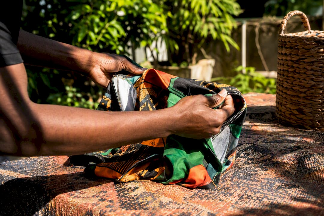
Straight-up red and green together is the fastest way to accidentally look like a holiday sweater. Muting one hue, burgundy instead of true red, or forest instead of kelly green, keeps the cultural signal while dodging the seasonal read entirely.
A few formulas adapted for this palette:
- Monochromatic: stay in one Pan-African hue across several values, a deep forest jacket over an olive tee, for a look that reads as tonal rather than flag-literal.
- Analogous: pair red with adjacent warm tones like rust or burnt orange for a softer transition than red against pure black.
- Triadic: bring in yellow sparingly, a single stitched detail or button color, since a full triadic red-yellow-green combo at equal weight is the one arrangement most likely to look like a costume.
- Complementary: green against a warm neutral like camel or rust gives contrast without needing black or red in the mix at all.
Before committing, hold the fabric swatches together under natural light and snap a photo. Colors that look balanced on a screen sometimes clash in person, and the camera test catches that faster than staring at swatches on a table.
How should skin tone and fabric texture guide your color choices?
Texture changes how a color reads before hue even enters the conversation. Matte finishes, chenille, and washed denim all soften a bright accent, while glossy prints push the same color to look louder and flatter.
For deeper skin tones, warm-muted reds, forest green, and mustard tend to sit better against the skin than primary-bright versions of the same colors, since the muted versions avoid the harsh contrast that pure saturation can create. Echoing one color from a graphic into a single accessory, a cap, a bracelet, a shoelace, ties a look together without adding a second full accent color.
Placement matters too. An accent near the face (collar, cap, hood trim) draws attention upward, while accents at the hem or footwear pull the eye down and can visually lengthen the silhouette.
- Matte and chenille textures soften bright accents; glossy prints intensify them
- Muted warm red, forest green, and mustard flatter deeper skin tones better than primary-bright versions
- Face-adjacent placement draws attention up; hem or footwear placement elongates the line
Pro Tip: If you’re unsure whether an accent color works with your skin tone, hold the fabric under your jawline in natural light before cutting or ordering. It’s a five-second test that saves a lot of regret.
Why everyday Pan-African style beats occasion-only dressing
Most advice on wearing heritage colors treats them like something you reach for once a year, a heritage month event, a specific celebration, then put back in the closet. That framing is backwards. Colors tied to identity should show up on a random Tuesday, not just when there’s an occasion to justify them.
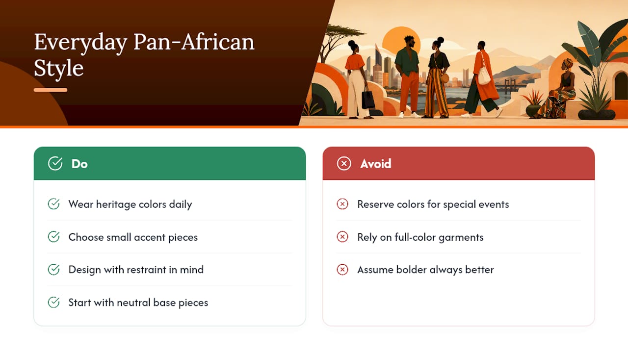
The overrated piece of conventional wisdom is that bold equals better. In practice, the outfits that actually get worn on repeat are the ones where the accent is small enough to survive a commute, a workday, and a wash cycle without feeling loud or fragile. Full-color garments look great in a lookbook and sit in a drawer the other 350 days a year.
What the research on proportion and saturation actually supports is restraint at the design stage, not at the identity stage. Wearing less color doesn’t mean caring less about what it represents. It means building pieces durable and versatile enough that you reach for them constantly, which does more for visibility than one flag-bright statement piece ever will. Start with the base and neutral choices first. The accent color is the easy part.
— Kebz
Shop pieces built around this exact color system
Afro Urban Apparel designs around the same ratio this article walks through: heavyweight tees and hoodies as the neutral base, with red, black, green, and yellow showing up through chenille embroidery, woven trims, and screen-printed panels instead of full-garment color.
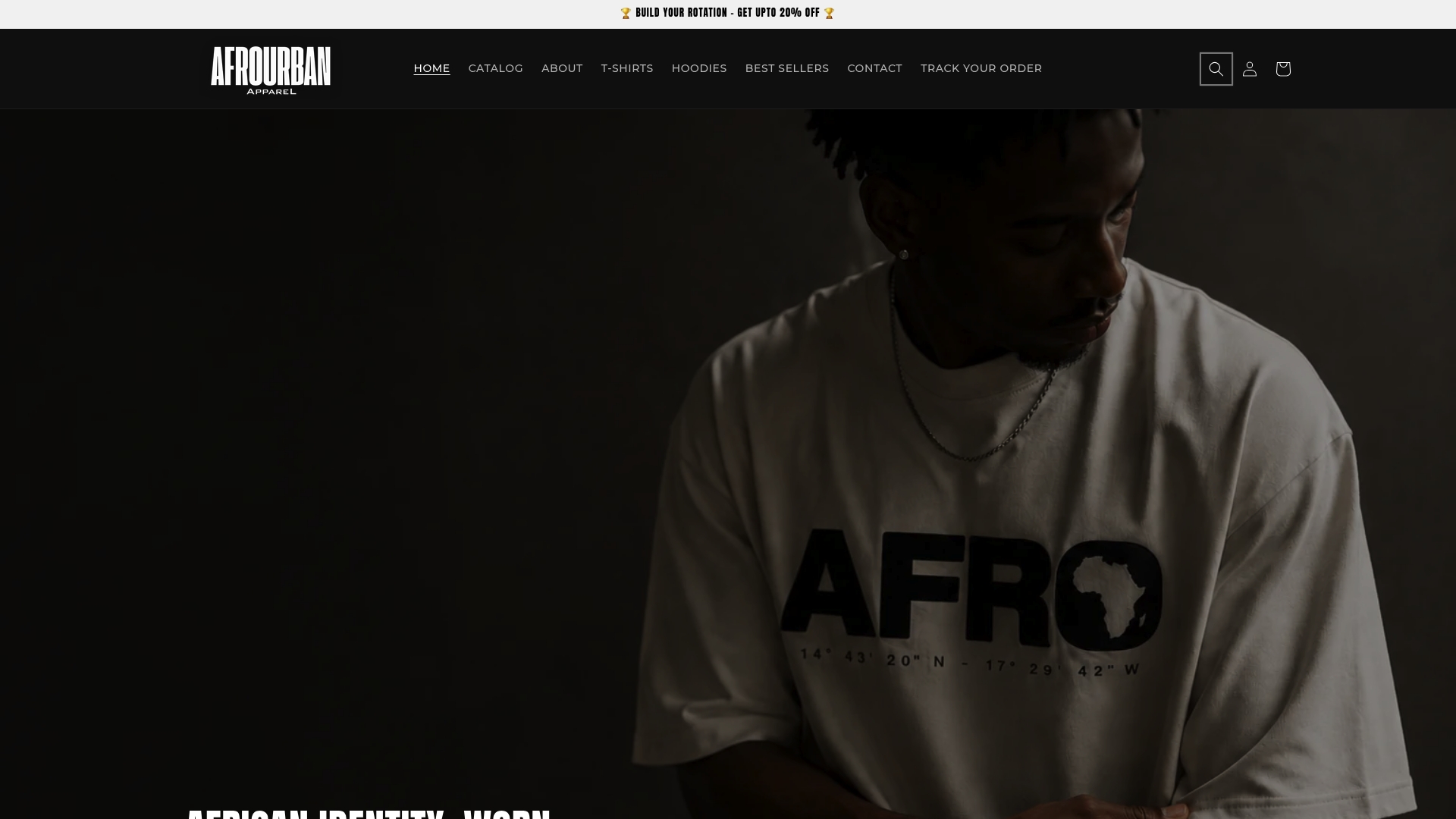
The fabric choice isn’t incidental. Heavyweight cotton holds color and shape through repeated washing, which matters when the accent is doing a specific job on the garment rather than covering the whole thing. Customers consistently point to that durability, along with designs that feel considered rather than decorative, as the reason pieces get worn weekly instead of saved for special occasions. If you want a shortcut past the swatch-testing and proportion math covered above, browse the Afro Urban Apparel collection and start with one accent piece, a cap, a trim detail, a chenille patch, before building out the rest of your neutral base around it.
Sources
A few sources back the color-harmony and proportion guidance covered here. Vogue’s breakdown of color theory for clothing shows how monochrome, analogous, and complementary palettes play out on real garments. Beyond the Blank’s apparel color guide covers desaturation techniques in more technical detail. Padloom’s streetwear aesthetic guide lays out the proportion ranges referenced throughout this piece, and WEAR2AM’s color theory blog offers the echo-color technique used in several outfit recipes above.
- Color theory for clothing – Vogue
- Color 101: How Color Impacts Apparel Design – Beyond the Blank
- Streetwear Aesthetic: Colours, Patterns and How to Build It – Padloom
- Color Theory for Streetwear: Stop Wearing Colors That Clash — WEAR2AM Blog